
Your bedroom color directly impacts your sleep quality by triggering specific emotional and physiological responses in your brain. Blue tones promote the longest sleep duration by lowering your heart rate and blood pressure, while green shades reduce stress hormones and create a calming atmosphere. You’ll want to avoid warm colors like red and orange, which energize your mind and disrupt sleep patterns. Brightness levels also matter—softer, muted tones help you wind down more effectively than vibrant hues. Understanding these color principles will transform your nightly rest.
The Science Behind Color Psychology and Sleep
While you mightn’t realize it, the colors surrounding you in your bedroom directly influence your brain’s ability to wind down for sleep.
Color psychology research reveals that different hues trigger distinct emotional responses in your mind and body. When you’re exposed to calming colors, particularly shades of blue, your heart rate naturally decreases and your body prepares for rest.
Blue hues naturally lower your heart rate and signal your body to prepare for restful sleep.
Studies show that bedrooms featuring blue tones promote the longest sleep duration compared to other colors. Conversely, warm colors like red and orange stimulate energy and create negative emotions that disrupt sleep quality.
For ideal rest, you should choose muted shades and lighter greens that foster tranquility. Creating a peaceful bedroom environment through strategic color selection greatly enhances your overall sleep experience.
How Colors Trigger Emotional and Physiological Responses
When you’re exposed to different colors, your brain processes these visual stimuli through complex neurological pathways that directly influence your emotional state and physical responses.
Your nervous system reacts automatically to color wavelengths, triggering hormonal changes that can either elevate your stress levels or promote relaxation throughout your body.
These color psychology mechanisms work behind the scenes to regulate your heart rate, blood pressure, and sleep-wake cycle, making your bedroom’s color scheme a powerful tool for optimizing rest.
Color Psychology Mechanisms
Because your brain processes color through complex neural pathways that directly influence your emotional and physiological state, the hues surrounding you in your bedroom can dramatically affect your ability to fall asleep and stay asleep.
Color psychology reveals how different wavelengths trigger specific emotional responses through your visual cortex. When you’re exposed to calming colors, your nervous system receives signals that promote tranquility and reduce stress levels.
Here’s how colors create a soothing environment:
- Blue tones lower your heart rate and extend sleep duration
- Green shades connect you to nature, reducing cortisol levels
- Darker hues promote relaxation by minimizing stimulation
- Bright colors increase alertness, disrupting your bedroom atmosphere
Understanding these mechanisms helps you choose colors that enhance sleep quality rather than hinder your body’s natural wind-down process.
Physiological Sleep Responses
Your body responds to bedroom colors through measurable physiological changes that directly impact your sleep cycle. When you’re surrounded by blue hues, your heart rate and blood pressure naturally decrease, creating ideal conditions for sleep onset.
These physiological responses aren’t just psychological—they’re measurable changes that color affects in your nervous system.
Green shades trigger similar calming reactions by reducing anxiety levels and promoting relaxation. Your body associates these colors with safety and tranquility, leading to longer, more restorative sleep periods.
Conversely, bright colors like red and orange stimulate your nervous system, increasing energy and making relaxation difficult.
Muted colors create the most effective calming atmosphere for sleep quality improvement, as softer tones minimize stimulation while maximizing your body’s natural preparation for rest.
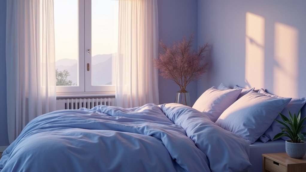
Blue: The Ultimate Sleep-Promoting Color
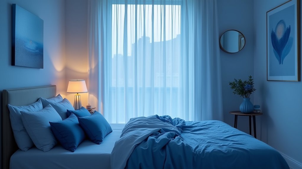
Since ancient times, humans have instinctively linked blue with tranquility and peace, making it the gold standard for sleep-promoting bedroom colors.
Research confirms that blue’s calming properties directly enhance sleep quality by creating physiological changes that prepare your body for rest.
Blue’s sleep-enhancing benefits include:
- Extended sleep duration – Studies show bedrooms with blue hues promote longer average sleep times
- Reduced heart rate and blood pressure – Blue’s calming effects help your cardiovascular system relax
- Enhanced feelings of safety – Light blue shades create a serene atmosphere that fosters security
- Improved sleep hygiene – Blue bedroom decor elements like accent walls amplify restful sleep conditions
You’ll experience maximum benefits by incorporating light blue into your walls and bedding, transforming your space into a sanctuary for restorative rest.
Green: Nature’s Calming Influence on Rest
You’ll discover that green’s psychological benefits stem from its deep connection to nature, triggering your brain’s relaxation response and lowering stress hormones that interfere with sleep.
When you’re selecting green shades for your bedroom, lighter tones like sage and mint work best because they won’t overstimulate your senses before bedtime.
These calmer greens create the perfect atmosphere for your mind to unwind, helping you fall asleep faster and wake up feeling more refreshed.
Green’s Psychological Sleep Benefits
When you’re seeking a bedroom color that naturally promotes restful sleep, green offers unparalleled psychological benefits rooted in our deep connection to nature. This color’s tranquility directly impacts your sleep quality by reducing anxiety levels and creating an atmosphere that encourages deep rest.
Green’s calming effects on your mind include:
- Stress reduction – Soft shades like sage actively lower cortisol levels, helping you unwind faster.
- Anxiety relief – Green’s natural association promotes feelings of safety and security.
- Enhanced relaxation – Your nervous system responds positively to these earth-toned hues.
- Improved mood – Natural elements in green foster hope and happiness before bedtime.
Choosing Green Bedroom Shades
Three distinct categories of green shades can transform your bedroom into a sleep sanctuary, each offering unique benefits for rest and relaxation.
Light greens like sage create the most soothing atmosphere, delivering powerful psychological benefits that reduce anxiety and enhance sleep quality. These softer shades promote tranquility without overwhelming your space, making them ideal for bedroom walls or bedding.
Mint green offers a revitalizing yet calming presence that maintains the restful qualities you need for quality sleep. Medium-toned greens work best as accent colors rather than dominant shades, preventing overstimulation while preserving the relaxation benefits.
Avoid bright or neon greens in your bedroom, as they’re too energizing for rest. Instead, choose muted, nature-inspired shades that mirror the peaceful qualities of outdoor environments.
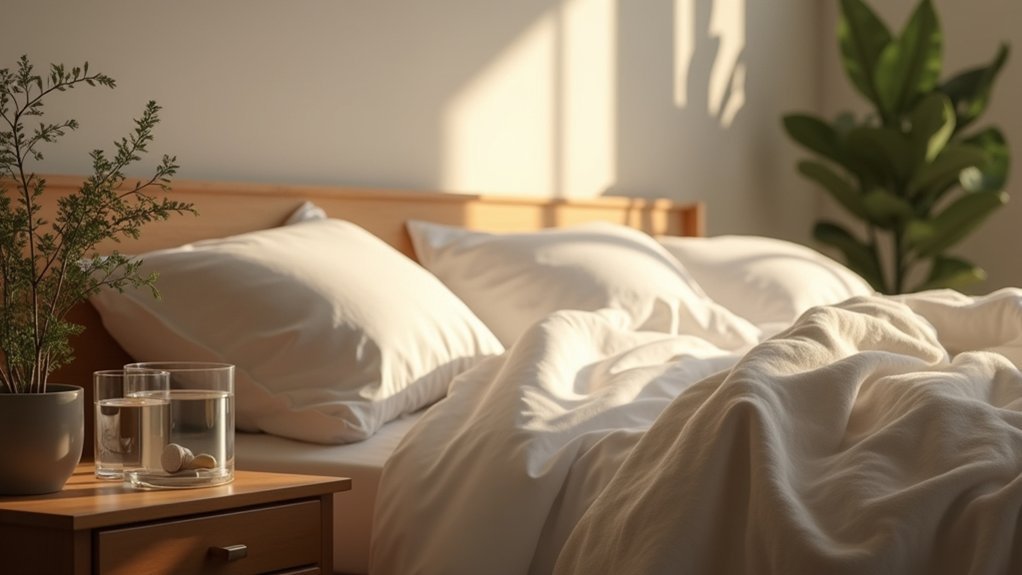
White and Neutral Tones for Peaceful Slumber
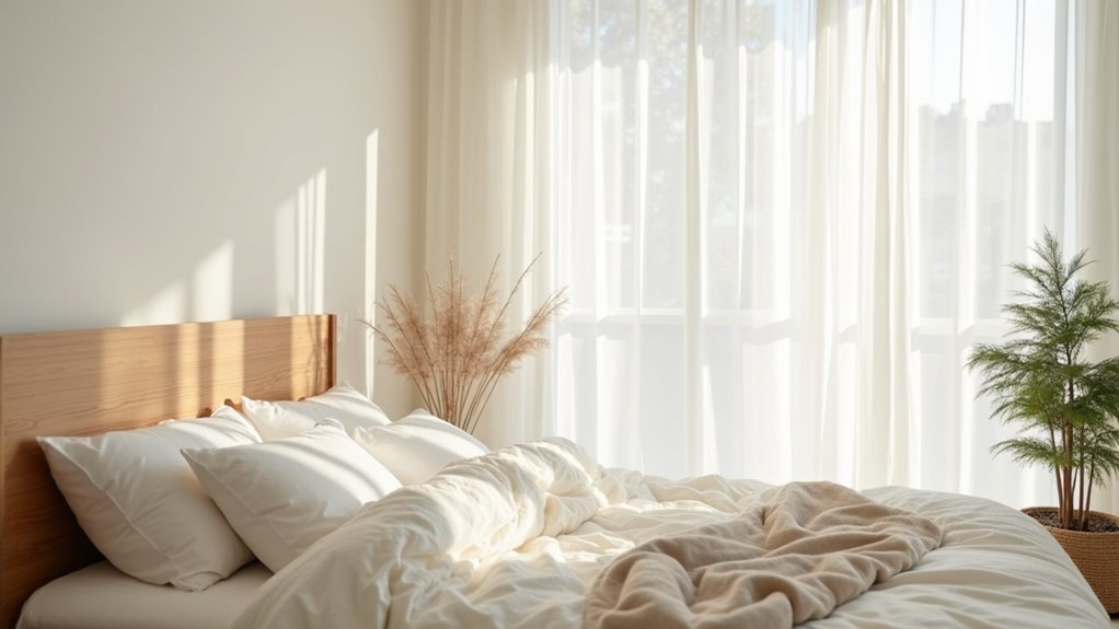
While bold colors might energize your mind, white and neutral tones like beige and light gray work differently—they create a serene, spacious atmosphere that naturally reduces stress and promotes deeper relaxation.
These calming shades stimulate less brain activity than vibrant hues, giving your mind the mental clarity needed for better sleep.
Research shows that white and neutral tones deliver measurable benefits:
- Lower heart rates and reduced anxiety levels in bedroom environments
- Enhanced perception of cleanliness and order for easier wind-down routines
- Versatile decorating options that accommodate calming accents without overwhelming the space
- Clutter-free mental space that encourages restful slumber
You’ll find that this serene ambiance helps you shift from daily stresses to peaceful sleep, making white and neutral tones ideal for promoting relaxation.
Red and Warm Colors That Disrupt Sleep Patterns
Although white and neutral tones promote tranquility, red and warm colors create the opposite effect—they’re scientifically proven to disrupt sleep patterns through physiological arousal.
Red triggers heightened emotions like fear and anger, increasing your heart rate and blood pressure when you’re trying to wind down. Warm colors such as orange and bright yellow energize you, sparking creativity and excitement that prevent restful sleep.
These high-intensity colors create sensory overload, making relaxation nearly impossible. Studies reveal that bedrooms painted in red lead to shorter sleep durations and uncomfortable restlessness.
Instead of choosing colors that disrupt sleep, opt for softer alternatives like light pink or muted tones. These gentle hues establish a calming atmosphere and naturally improve sleep quality.
Dark Colors and Their Negative Impact on Rest
Beyond warm colors, dark hues pose equally serious threats to your sleep quality by triggering unwanted psychological and physiological responses.
When you choose dark colors like deep red or dark purple for your bedroom, you’re creating conditions that stimulate rather than soothe your mind.
Dark bedroom colors like deep red and purple create stimulating conditions that energize rather than calm your mind for sleep.
The negative impact of these shades manifests through several concerning ways:
- Increased stimulation – Dark colors boost energy levels when you need relaxation
- Emotional disruption – These hues evoke negative feelings and confinement sensations
- Heightened anxiety and stress – An oppressive atmosphere develops, preventing restful sleep
- Mental overstimulation – High-contrast combinations keep your brain alert and engaged
You’ll find it challenging to achieve the calming ambiance necessary for quality rest when surrounded by overwhelming dark tones.
The Role of Brightness in Sleep Quality
When selecting bedroom colors, brightness levels matter just as much as the hue itself in determining your sleep quality.
Darker shades create a calming effect by reducing visual stimulation, helping your mind shift into rest mode. Meanwhile, high brightness colors like vibrant yellows and oranges increase alertness, making it harder for you to wind down.
You’ll achieve better sleep by choosing colors with lower brightness levels.
Studies show that softer blues and greens promote longer sleep durations compared to brighter alternatives. These soothing color choices minimize sensory overload and enhance feelings of tranquility in your bedroom.
Personal Preferences vs. Universal Color Effects
While research shows that blue bedrooms universally promote longer sleep, your personal connection to specific colors can be just as powerful in creating a restful environment.
You’ll need to balance scientific evidence with your own emotional responses to colors, since a shade that calms one person might feel sterile or uninviting to you.
The key isn’t choosing the “perfect” sleep color, but finding the right blend of proven color effects and your individual preferences that makes you feel most comfortable and relaxed.
Individual Color Preferences
How do your personal color preferences stack up against scientifically proven sleep-promoting hues?
While research shows that blue and green generally promote calmness, your individual color preferences carry equal weight in determining sleep quality. Your personal associations with specific colors create powerful emotional connections that directly impact your bedroom environment.
Your psychological responses to colors depend on unique experiences and memories:
- Light pink might feel soothing if you associate it with comfort and tenderness
- Muted greens could evoke tranquility through nature connections
- Beige tones may provide relaxation through warmth associations
- Lavender shades might calm through spa-like memories
Rather than forcing yourself into universally “correct” soothing colors, prioritize hues that genuinely resonate with you.
Your personal color story matters more than generic recommendations when creating an ideal sleep sanctuary.
Universal Sleep Responses
Although personal preferences matter considerably, certain colors trigger universal sleep responses that transcend individual tastes. You’ll find that blue and green consistently promote relaxation across diverse populations, making them ideal choices for your sleep environment.
Research shows bedrooms painted in calming shades like soft blue correlate with longer sleep durations compared to stimulating colors such as red or bright yellow.
Your emotional responses to color depend heavily on brightness levels. Pastel and muted tones generally foster serenity that benefits sleep quality, while lighter shades evoke positive feelings that enhance relaxation.
Despite individual variations in color preferences, the psychological effects of blue and green remain universally recognized as conducive to creating a restful sleep environment that improves your overall sleep experience.
Balancing Personal Choice
Since your personal preferences greatly impact how comfortable and relaxed you feel in your bedroom, you shouldn’t automatically dismiss colors that fall outside universal recommendations.
While blue and green are typically calming and soothing, your emotional associations with specific shades matter more than standard guidelines.
Consider these strategies when selecting your bedroom palette:
- Experiment with different hues that personally resonate with you, even if they’re not traditionally sleep-promoting
- Test light versions of colors you love to maintain a relaxing atmosphere
- Combine your preferred colors with softer tones to balance personal taste with sleep science
- Trust your instincts about which colors affect your mood positively
Creating Your Optimal Sleep Color Palette
What makes one color palette more conducive to sleep than another? The best colors for your bedroom focus on soft blues and greens, which naturally promote calmness and tranquility.
These bedroom colors for sleep have been scientifically linked to longer rest periods and improved sleep quality. You’ll want to create a soothing atmosphere by choosing lighter shades like beige and cream, which foster feelings of comfort without overstimulation.
Avoid vibrant reds and oranges that trigger alertness when you’re trying to unwind. Your sleep environment benefits most from pastel tones that reduce mental stimulation.
Frequently Asked Questions
What Is the Best Color for Bedroom for Better Sleep?
You’ll sleep best with blue walls since they’re proven to increase sleep duration and promote calmness. Green, light pink, white, and gray also work well, but avoid stimulating colors like red and bright yellow.
Does the Color of Your Bedroom Affect Your Sleep?
Yes, your bedroom’s color directly affects your sleep quality. Blue promotes longer sleep and better rest, while bright colors like red increase alertness. You’ll sleep better with calming, muted tones than stimulating ones.
What Color Helps Improve Sleep?
You’ll sleep better with blue walls since it’s scientifically proven to promote longer sleep and calmness. Soft greens and light pink also work well, while you should avoid stimulating reds and bright yellows.
What Is the Best Color for Bedroom to Promote Sleep?
You’ll sleep best in a blue bedroom, as it’s linked to longer sleep duration and calmness. Green’s another excellent choice, promoting tranquility and reducing anxiety for better rest.

Leave a Reply